Random Snacks - A case study of forging a user centered design culture

The company graze produces and sells a wide variety of healthy snacks through an online subscription service, an online shop, and in stores.
#The challenge
Graze had 2 separate sites (a subscription service and a blog) and were planning to add a Magento powered traditional e-commerce site to their portfolio.
As a fast growing start-up there was an understandable lack of holistic oversight. Pages and features were often built in isolation without consideration of overall user journeys or UI conventions. As a result of this pages were often visually and functionally different in many ways with confusing journeys, dead-ends, and imprecise messaging. This was causing a poor user experience, low user trust, and increasing levels of customer support requests.
As a further technical complication there was often huge amounts of bespoke CSS and JavaScript written for individual pages. This had led to performance problems and a bloated, hard to maintain front end codebase.
With the new e-commerce site being developed, there was an opportunity and desire to address some of these issues.
To summarise there were two main challenges:
- Incoherence and inconsistency (visually and functionally)
- Confusing user journeys and poor user experience
#Execution: Audit
We performed a full audit of every page across our sites and discovered some startling facts:
- We had over 250 colours in use including 30 shades of grey alone
- We had 7 separate button styles
- Single pages had as many as 10 different typographic styles
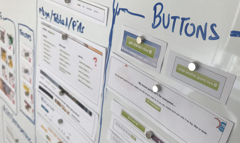
We worked with the customer support team and analysed their entire history of support requests to identify particularly problematic user journeys.
We worked with the data team to gain insight into usage patterns for users, especially those who subsequently churn and also those who fail to complete sign up.
#Execution: Design
We conducted multiple workshops with the brand and marketing team to gain their input on the overall visual design direction we wanted to take. We decided on a reduced colour palette (with accessibility concerns such as contrast taken into account) and consistent usage of typography and images.
At the same time, we worked with the development and digital product team to agree on a suite of UI components that we wanted to use going forwards. There were multiple considerations such as accessibility, performance and robustness but we ended up with a good starting list of UI components which grew over time.
#Execution: The first hurdle
All of this preliminary work formed the basis for what eventually became pistachio - the graze.com styleguide and front end framework. We began with basic web elements such as buttons, forms, typography, the colour palette, and some basic UI components. Over the course of time more UI components were added but only where there was agreement that they were appropriate.
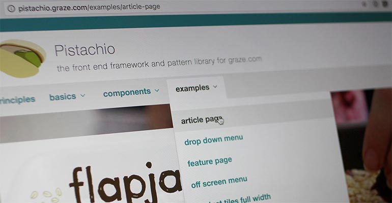
This front end framework was built and hosted entirely separate from the rest of the codebase to ensure we could enforce a consistent look and feel across our existing sites, and the newer e-commerce site which was being built. Because user testing and discussions were still going on, the front end framework went through many iterations but we were able to roll these changes out across all our sites at the same time due to treating it as a separate codebase.
This gave us a good starting point and addressed the inconsistency problem discussed above. Our sites and pages were now at the very least visually and functionally consistent. We were now able to start building the new e-commerce site without further confusing our users with inconsistency across sites.
Now we began the work to understand and improve some of our more problematic user journeys.
#Execution: Wireframing, prototyping and user testing
As part of our audit work we had a pretty good idea of the main areas of pain for our users and we prioritised these alongside the other consideration of choosing work that was valuable to the company in terms of revenue. We also had to work out how to combine a subscription service and a traditional e-commerce service into one coherent experience.
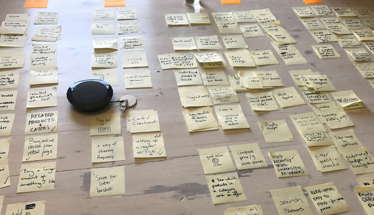
We also sought to clear up some "dead-ends" on the site by offering more onward journeys. This was a focus for us because we knew from the data audit that customers who were more engaged in using the site and in reading about our products were less likely to churn or bounce.
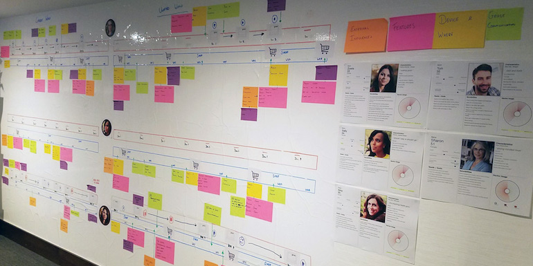
We developed user personas and mapped out their interactions with graze (which included events outside website interaction, such as purchasing a graze snack in a retail store or receiving an email). We used this as a starting point for discussions with key stakeholders.
We began scheduling regular user testing sessions. We reached out to existing graze customers as well as non customers and spoke to passers by on the street outside the office. We would test everything from wireframes, sketch mockups, and screenshots. When user testing sessions were taking place in the office, we invited people from around the business to watch and listen to increase visibility of the work we were doing, and to expose some of the feedback we were getting from our subjects.
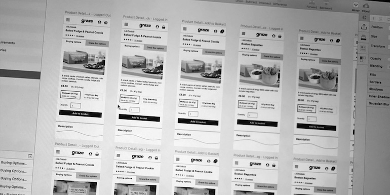
Further down the process we built a prototype graze website where we could put a curated but "real" web experience in front of our test subjects. This was further demonstration of the value of the front end framework we had already built as we were able to mock up pages incredibly fast.
We learnt as much and as quickly as we could and continually refined our prototypes. Alongside this work we were running some multivariate tests on the live websites to further guide the general direction we were taking. We were seeking confirmation that our proposed user journeys were understandable, and that our interactions were clear.
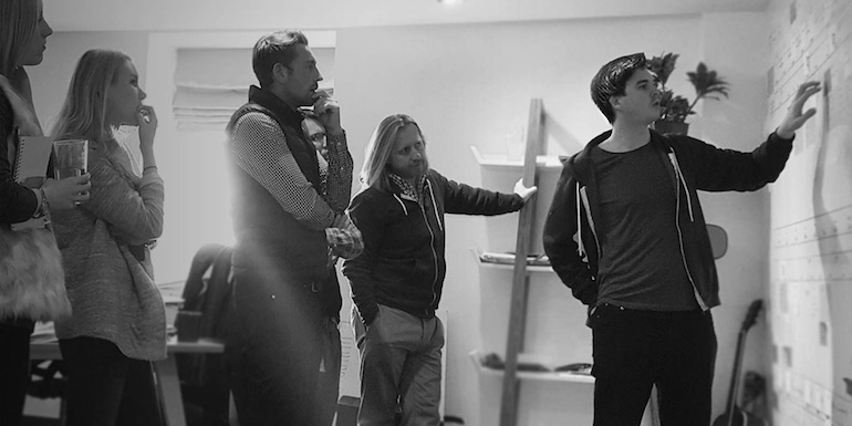
We hosted weekly design reviews and presented our designs and proposals publicly to key stakeholders but also opened the invitation to anybody in the business who wished to attend.
#The outcome
The outcomes of our ongoing research, design, and user testing began to dictate what made it into the development backlog. We prioritised work that had the most potential to increase sales and conversion and reduce churn. Most importantly we were able to demonstrate exactly why we were prioritising certain tasks by discussing and presenting our research.
Some noteable examples include:
- A complete restructuring of the navigation into more understandable groups
- A rebuild of the subscription sign up flow which increased conversion on mobile by 8%
- A more useful homepage that was personalised and invited users to interact with the site further
- A more simplified UI for subscription customers to personalise their subscription
- A reduction in customer service tickets for certain recurring issues
- A single product component that accommodated UI for both e-commerce and subscription customers with cross-sell opportunities
- Development of email templates which were consistent with the website visually
#Conclusions
The move towards user centric design at graze was a complicated process which involved almost every part of the business. By making our work highly visible we made the wider business aware of who our users actually were and what sort of issues they were facing. We encouraged collaboration between teams by hosting sessions with the wider business, directing their attention to our users, and letting everybody discuss solutions.
We often had to sell the value of our work and be prepared to justify our suggestions and designs. Some of our results were clearly quantifiable which improved confidence in our work.
As a person from a development background, I took great delight in knowing that people in the various development project teams had a better idea of why they were building features and who they were building them for.
My personal passion for user centric design springs from a deep rooted empathy for the user which comes from my many years experience as a (predominantly front-end) web developer. However, there are provable benefits for almost any business metric you could consider.