Designing a Game UI
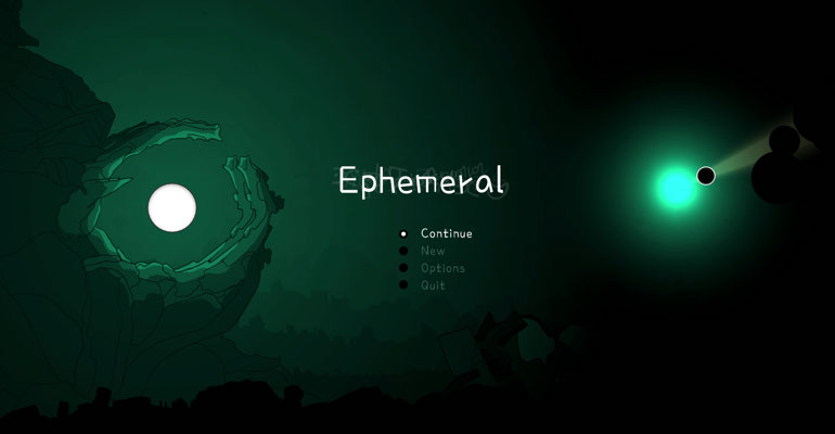
I'm working on a passion project to create Ephemeral, a roguelike tower defense shooter game which frankly is ambitious and I should be applauded for my audacity. I'm going to talk about the UI design for this game because I have a long career as a UI expert and I always feel like I should be writing more.
The game itself revolves around light versus dark with the player placing nodes of light in an otherwise dark void filled with dangers. I set out with several intentions:
- Introduce core concepts as the game is played
- Communicate purpose through visual design
- The user interface should be understandable to even the least experienced players
#1. Introduce core concepts as the game is played
Every game of Ephemeral starts the same way, with the player controlled cursor being birthed from a small bead of light surrounded by incomprehensible machinery in a dystopian wasteland filled with darkness. Immediately, your mother light begins to talk to you, to tell you what you are.
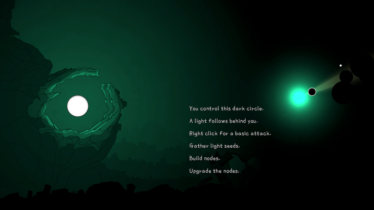
This isn't a tutorial that you can enable or disable, it happens every time. Ephemeral is not a game you are supposed to easily win. It's punishingly hard and the only way you can noticeably improve is to hold out for longer against the darkness. The controls are basic and the way they are introduced is not interruptive to the player, they are just part of the aesthetic and worldbuiding.
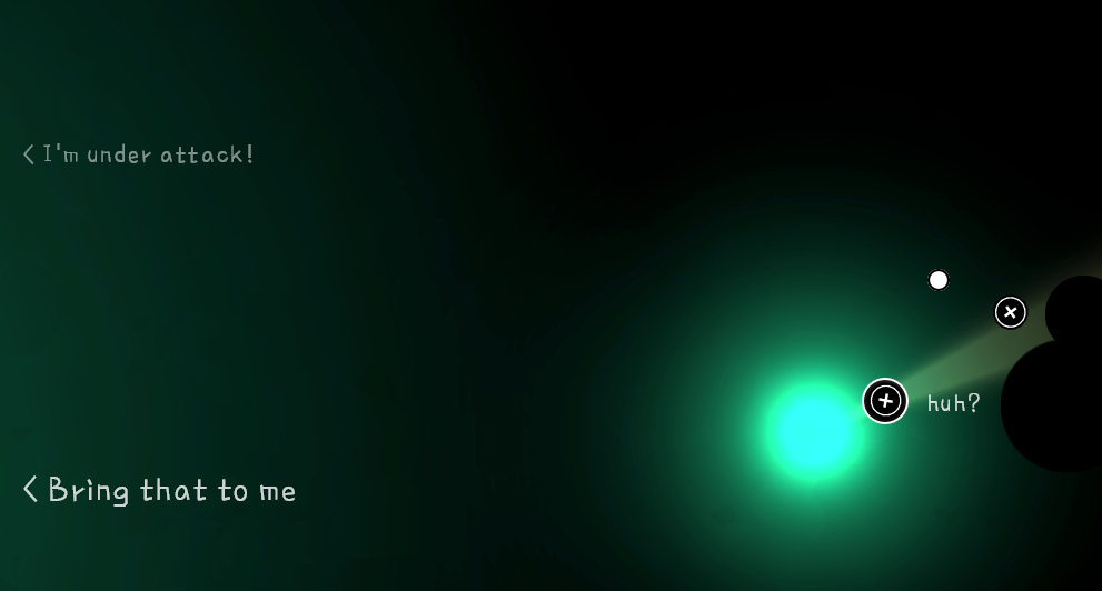
You mother also talks to you when she is off-screen, the chevron pointing in her direction. Her messages are smaller (quieter) the further you are away from her. The entire game revolves around a loop of pushing out and claiming territory before retreating and defending your home base, your mother light. The tempo of this loop is reflected in the background color and musical cues, aiding the player in understanding the current state of the game.
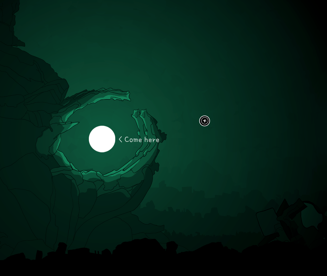
The player gathers light seeds and consumes them to place a light node. These nodes are how the player defends against the encroaching darkness and they can be upgraded by collecting more light seeds from the world and placing them directly into the available empty slots in the node's menu
Some limited player testing indicates that the use of white and black here lends itself to intuitive placement of light seeds. Even less experienced players were able to determine the purpose of this menu with some experimentation. Failing that, there are also some hints that mother will provide after a certain amount of time has passed.
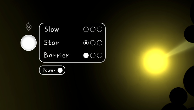
Your cursor literally "carries" the light seeds which are dropped directly into the empty slots in the node menus. This interaction also adds to the core gameplay mechanic of competing concerns: If I push out further I could find another seed but can I bring it back in time before we are attacked again? This tension has been described by playtesters as "constant unease" which is exactly how I wanted it to feel.
The various node upgrades available are randomly determined from 3 separate tiers of options, all of which have visual designs intended to communicate their purpose. Which leads to point 2.
#2. Communicate purpose through visual design
The design intent here was that each node type should convey their mechanics through their design.
to be continued...