Introduction to flexbox

Flexbox is a great tool for web developers to more easily lay complex sites out. It solves a lot of problems that have plagued web developers and designers since the dawn of the internet and is a huge leap forward for the web and HTML/CSS in general.
#A short history lesson
The Internet has come a long way since it was first created and the original spec for HTML and CSS (written in 1992) has been exposed as being a bit creaky.
Some of the most elaborate and intricate web sites and apps you see today are created using a language that really was not originally designed for much more than simple text documents that linked to each other, maybe with the odd image. In order to do this, developers and designers have to work really hard with the limited layout options available.
Anybody who has ever attempted to make a web site has probably very quickly come across something that feels like it should be easy but isn't. When you factor in all the different browsers and devices people could be using, it ends up being very hard indeed. Some of these problems are solved by flexbox.
#Flexbox
Flexbox is a recent example of new functionality being added to address some of the parts where HTML and CSS has been lacking. It was originally first implemented in some browsers in 2009 but is now at the stage where it's almost universally available in browsers (82.74% at time of writing)
I'm going to quickly recap on the existing options for laying out web pages before we introduce flexbox in more detail.
#display: inline
display: inline implements inline formatting context
In an inline formatting context, boxes are laid out horizontally, one after the other, beginning at the top of a containing block.
w3.org
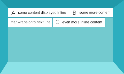
- Inline elements flow like text and are sized with text properties rules e.g. line-height and font-size.
- Inline elements will wrap onto the next line when they run out of space in their container
- Width and height properties have no effect.
- Margin and padding properties only have an effect horizontally.
These elements are inline by default:
-
a -
span -
img
img is perhaps the most surprising one in this list because you tend to think of them as blocks of content rather than something that would be treated like text.
#display: block
display: block implements block formatting context
In a block formatting context, boxes are laid out one after the other vertically.
w3.org
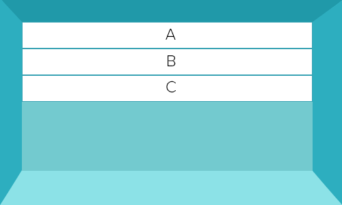
- By default, block-level elements begin on new lines.
- Block level elements do not flow like text.
- Width and height properties will work.
- Margin and padding properties will work vertically and horizontally
These elements are block by default:
-
div -
hr -
p -
ul
#display: inline-block
A way to make elements inline, but preserving their block capabilities.
robertnyman.com
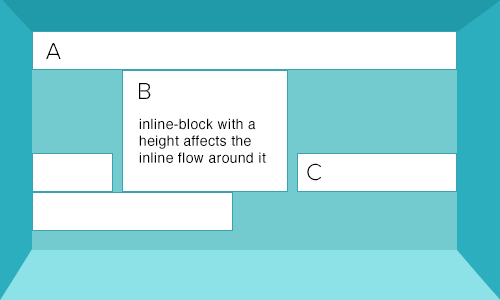
- Inline-block elements behave as block level elements within the inline formatting context.
- Can be used to place multiple block-like elements on the same horizontal line without floating them.
- Width, height, margin and padding properties will work.
These elements are inline-block by default:
-
button -
textarea -
input
#Current layout solutions
Web developers and designers have been using these various display types (inline, block, inline-block) to lay out incredibly intricate web pages and apps for years and several standards or patterns have emerged.
#Using inline-block for layout
Very suitable for rows of blocks e.g. for navigation. Some CSS frameworks such as YUI use inline-block for grid layout.
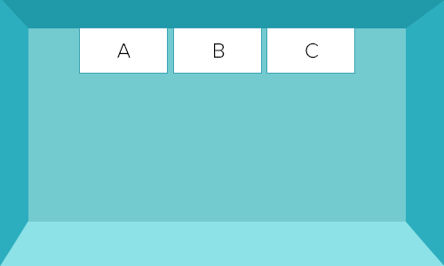
#Advantages of inline-block:
- Widely supported (97.57%).
- Properties such as text-align can affect horizontal layout
- Vertical-align property can be used to affect vertical layout
#Problems with inline-block:
- Inline-block elements have a single whitespace character between them by default as they are essentially treated as flowing like text.
- All fixes to remove whitespace are essentially hacks with varying degress of reliability.
- The letter spacing hack as used by YUI seems to be the most reliable hack for whitespace (in this writer's opinion).
#Floated blocks for layout
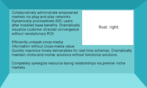
Float was originally only intended to allow text to wrap around an image like this:
However, use of floated blocks has become the most popular and widely supported solution for full page layout. Most of the popular CSS frameworks such as Boostrap and Foundation use floats for grid layout.
#Advantages of floated blocks:
- Widely supported (97.5%)
- No whitespace between floated elements
#Problems with floated blocks:
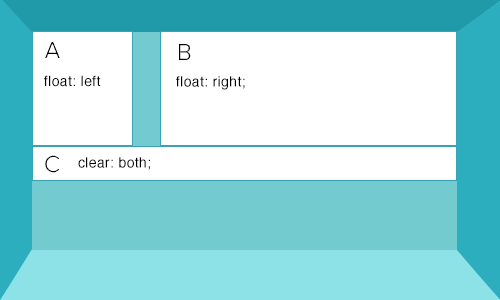
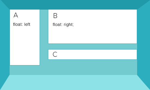
- Floats need to be cleared.
- Floats can push each other out of the way and break your layout:
Floats and clears force you to write more markup and I would argue are not intuitive to beginners. This is a classic example of developers working with the limitation of HTML and CSS and extending them beyond their original use case.
#The right tool for the job
Neither inline-block or floated blocks are a perfect solution for complex layouts. We can make them work but only by really pushing them to the limits of what they were originally designed for.
#Current layout limitations
There are certain things that seem basic but are actually quite hard to do with current HTML/CSS solutions.
For example:
- Vertical centering
- Same height elements without a fixed height
Often people rely on JavaScript to fix a problem that should really be addressed with CSS. The good news is that flexbox solves these problems.
#display: flex
display: flex implements flex formatting context
Simply adding display: flex; to an element creates flex formatting context inside that element. Here's an example of an unordered list set to act like a flexbox:
<ul style="display: flex;"></ul>
Once you've set an element to use flex formatting context it can be referred to as a "flex container". In terms of how a flex container fits into the document flow, it's easier to think of them as essentially block elements:
Flex containers form a containing block for their contents exactly like block containers do.
w3.org
The real magic happens inside a flex container.
#Flex items
A direct child of a flex container is referred to as a "flex item"
flex container
    |- flex item
    |- flex item
    |- flex item
    |- flex item
#Flex item axes
Whereas block and inline formatting contexts are always relative to the document flow (as explained earlier), flex formatting context introduces two axes along which flex-items are arranged.
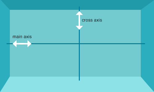
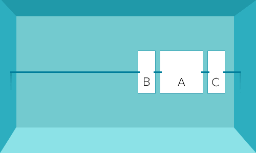
It's helpful to imagine the main axis as a rope along which flex items are strung:
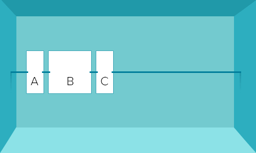
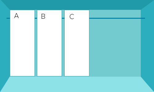
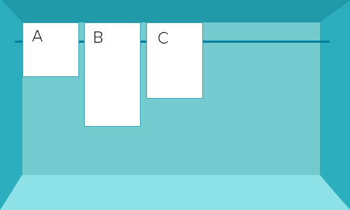
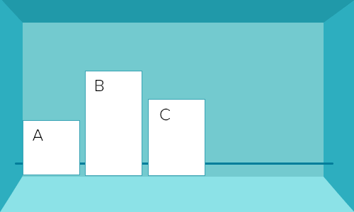
#Flex-direction
It's possible to change the direction of the main axis by using flex-direction
Possible values:
-
row(default) -
row-reverse -
column -
column-reverse
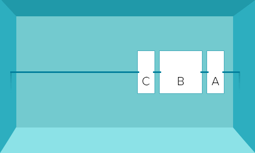
#flex-direction: row-reverse
#flex-direction: column
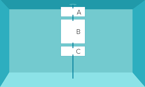
It's important to note that when your flex direction is set to column, the main axis is now vertical and the cross axis is horizontal.
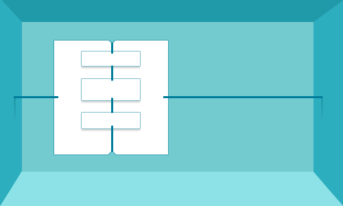
#Nested flexboxes
Flex containers can contain flex items that are themselves flex containers:
#Ordering flex items
Using order we now have a reliable way to produce markup that is semantically ordered for accessibility and SEO yet organised differently visually.
#Working with the axes
#Cross axis
All properties that modify the cross axis are prefixed with align. I'm only giving a few examples here.
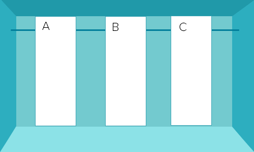
#align-items: stretch (default)
#align-items: flex-start
#align-items: flex-end
#Main axis
You can manipulate the behaviour of flex items on the main axis by using justify-content and can make the flex items wrap onto new lines with flex-wrap
#justify-content: space-between
#justify-content: space-around
#Interaction between flex items
This is quite a complex area of flexbox and the best thing to do is experiment as this is only a very short overview.
You can specify properties of individual flex items via flex-grow, flex-shrink and flex-basis or via the shorthand for all three, flex
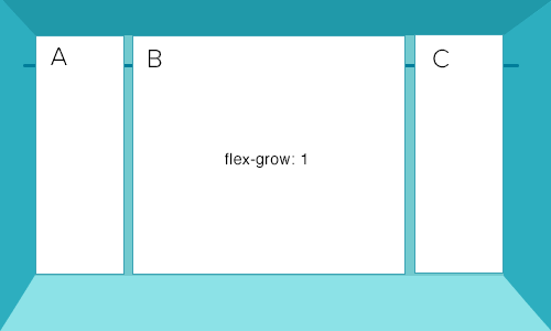
#flex-grow
Specifies how much space inside the flex container the flex item should take up where there is space left over from the other items
#flex-shrink
Specifies how far a flex item should shrink where there is no space in the container
#flex-basis
Specifies the initial base size of a flex element
#flex shorthand
flex is the shorthand way of combining flex-grow, flex-shrink and flex-basis together. All flex items have these values set by default:
// shorthand
flex: 0 1 auto;

// seperate properties
flex-grow: 0;
flex-shrink: 1;
flex-basis: auto;
#Flex item advantages
Flexbox is so useful because it solves common problems that previously required a lot of effort and markup to solve.
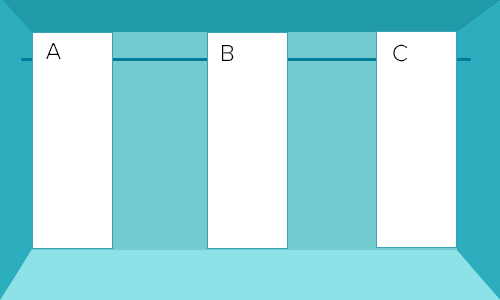
- Flex items are the same size by default across the cross axis
- Vertical centering is possible, and easy to achieve
- Flex items never push each other out of the way (unlike floated elements)
- Finally, a display model which makes logical sense
- It's incredibly flexible (no pun intended)
#Flex item nuances
The flexbox model is very useful, but it's not without it's nuances. I hesitate to call them problems because overall I'm very positive about flexbox and the layout problems it solves. However, these nuances are worth noting and might trip you up if you aren't expecting them.
#Margins do not collapse on flex items
This is a problem because we're used to working with block elements, where margins do collapse. To explain this, I'll give you an example of what display: block elements do.
On block level elements Vertical margins collapse.
When two or more margins collapse, the resulting margin width is the maximum of the collapsing margins' widths.
w3.org
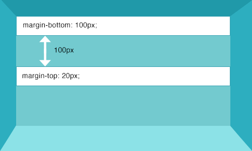
This doesn't happen with flex items, so you need to adjust your margins when using flex.
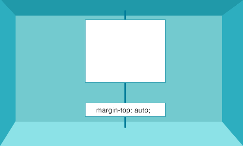
#Margin: auto
Margins set to auto absorb extra space and can be used for alignment e.g. you can have a "footer" flex item that is always at the bottom by setting margin-top: auto
#Flex items cannot be floated
-
float,clearandvertical-alignhave no effect on a flex item (but can be used inside a flex-item)
#Fallbacks for older browsers
Flexbox isn't globally supported yet so it's natural to want to provide a fallback for older browsers and it just so happens that I have built a css grid that does just that: reflex grid - a lightweight responsive flexbox grid with cross browser support, an inline-block fallback and no polyfills
#More info
#Acknowledgements
- Some images used from this flexbox article