Using photoshop to design for the web
#1) Disclaimer
I'm not a graphic designer, I am a web developer. However, I have a lot of experience with using Photoshop, illustrator and fireworks.
I spend a lot of my time taking designs provided by designers and making them into functional websites. Sometimes, a designer can create extra work for a developer by not being aware of some simple tips which can really help reduce development time. By being aware of these tips, you can ensure that a developer will find your designs much easier to work with and often can result in the final web pages resembling the provided design much more closely.
If a design is created with consideration to the following tips, it can reduce development time, the need for compromises and can also effectively eliminate any confusion over the designer's intent. Overall, the workflow will become more beneficial and efficient for all concerned.
#2) Fonts
Try to stick to the standard web safe fonts where possible. Using fancy fonts for section headers or logos is completely fine but it does add overhead to the page and makes it slower to load. To that end, there are several acceptable web safe fonts that are generally used.
#3) Use guides (and stick to them)

Once you have your design more or less finalised and it's out of the conceptual phase, create some guides and make sure everything lines up nicely along those guides. Clearly laying out the different sections on the page with guidelines will ensure you can maintain consistency of layout across multiple page designs and therefore allow the web developer to clearly understand and implement the structural layout of the pages.
#4) Keep things consistent
When you are using a certain element across multiple page designs, try to keeps things consistent. Web developers where possible will try to re-use as many assets as possible to keep things efficient. Using colour swatches to save your colour values and using layer styles to save your re-useable layer styles and apply them to new elements of the design as you create them will save so much time for the developer and best of all, they won't have to try and interpret whether or not tiny variations between page elements were intentional or not. Here's a useful guide to re-using layer styles in Photoshop
#5) Dynamic content
It's easy to layout a page when you are using filler text as you can crop the text to fit your design or design around a fixed amount of text. This is certainly applicable in designing for print but designers for web must take into account the fact that a lot of web content comes from databases - blogs, content management systems, product databases.
As a result of the dynamic nature of a lot of web content, designing around a fixed amount of text does not reflect the reality of the final web page. Keep in mind what your design should do when there is more or less content in a page section. Should the content be cropped? Should the section expand to accommodate it? What happens if this section expands and it no longer lines up perfectly with the rest of the page? If possible, run a few tests on different amounts of content in your page sections and perhaps leave a note for the developer indicating your expectations on how the design should change to accommodate dynamic content. Even better... provide a few examples.
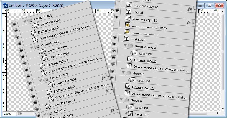
#6) Keep your layers tidy and concise
#Name your layers
It's always useful to name your layers where possible, or at least to name your layer groups. When working on the design, you have full knowledge of what each layer is but to a fresh pair of eyes "Layer 479 copy 2" means nothing. There are obviously ways to find out what a layer contains but why leave it to chance? A name like "small form button" is so much more useful.
#Delete unused layers
During the design process many things change and it is often better to hide a layer rather than delete it as you never know if/when you might need them again. However, when submitting your final design to a web developer, it is worth removing any unwanted layers to avoid confusion and ensure there is no danger of any old hidden layers re-appearing by accident in the final page.
#Group related layers together
It is good practice to group layers together that are part of the same page section. This ensures there is no room for error or confusion. Even better would be to...
#Use layer comps
The clearest way to illustrate to a developer exactly what each state of the page should look like is to use layer comps. For example you could have layer comps called "default", "mouseover", "selected", etc. Why leave it to chance? Use layer comps and communicate your design to the developer properly. If you need it, here is a brief tutorial on how layer comps work