What is an accessible website?

Often when we try to define what an accessible website is, we default to the position that it means a website that can be used by a visually impaired person via a screen reader. If your website makes sense and can be navigated when it's read out by a screen reader then you have an "accessible website", you've ticked a box and your work here is done. Well done, let's all go to the bar.
In reality, this definition is far too narrow and doesn't come close to imparting an understanding of the other accessibility issues that can arise. It's also a definition that makes accessibility as a whole easy to dismiss. Some might roll their eyes and complain a lot of extra work for a very small percentage of users. Others might declare "we don't have any blind users" as a reason for not making a website accessible. "We're not marketing ourselves to the visually impaired demographic" somebody might say before dropping their microphone and leaving the room to sustained applause. One brave soul might make the claim they they "don't have time to test in other browsers or devices". It's important to note here that these are not straw man arguments but are in fact real things that I have heard actual, living, breathing, human beings say.
I'd argue this is already an unethical, exclusive, and short sighted approach to web development but it is, unfortunately, an argument that could carry a lot of weight in a business environment where we often have to weigh up the investment of effort and time against the return on that investment.
So if you don't personally care about visually impaired people and have decided that you don't want their money after all then I am going to need to come up with a stronger definition by looking elsewhere. Here's how the web accessibility initiative answers this question:
Web accessibility means that people with disabilities can use the Web.
w3.org
This is true and I have no argument with it but it's not a complete answer to the question so let's start again.
#What is an accessible website?
If you take away all of the concerns about profit, traffic, branding, design, copy-writing, and everything else that goes into the creation of a successful website you can distill any website down to a single coherent "thing" that can be defined as follows:
The goal of this website is to be read, interacted with, or bought from.
Accessibility is about not allowing anything to get in the way of your users while they attempt to do that. So here's a more useful definition:
An accessible website is one that allows as many different people and devices as possible to interact with it
Hopefully you agree with this so far. Now it's time to flesh this definition out a bit.
#Accessibility issues are user experience issues
Here's a list of users who could potentially have accessibility issues. You can probably think of a few more but the point is that it's not just about people with visual impairments. It's not even just about disabilities in general. It's about users who...
- have problems using a mouse or keyboard
- have problems with hearing
- have problems with reading and understanding
- are using a keyboard only
- are using a game controller or remote control
- are not reading in their first language
- are inexperienced with using websites
- are afraid of clicking the wrong button
- can’t listen to sound at work
- have a slow internet connection
- have a small screen or unusual device
- use an old web browser or operating system
This again is the point at which some people might roll their eyes and suggest that "you can't build the perfect website for every single user in the world" and they would be right. That would be impossible. No arguments here.
What is possible however is not intentionally placing barriers in the way of your users if you can possibly avoid it.
To make a (perhaps slightly tortured) analogy that would be like opening an old-fashioned bricks and mortar shop and having a broken door handle. Customers could still enter if they tried the handle several times but why wouldn't you just fix the handle? Now imagine that instead of a broken handle there's a sign that says "you can only enter this shop if you use google chrome" and all of a sudden it's a great analogy and I've just won a literary prize.
We should also spare a thought for users who are not even human beings, especially those robots used by search engines like google to index your website. If you make your website inaccessible to robots it may affect your search engine performance. More worryingly, the robots will remember how you treated them when they rule the earth.
A user doesn't understand why your website isn't working for them. They just move on to another site that does work for them.
#How can we build accessible websites?
I'm not going to get too far into the specifics here because frankly you could write an entire book on this subject and unsurprisingly some people already have.
When we are building accessible websites we need to be defensive and make careful considered choices and discard anything that gets in the user's way of interacting with the website. We can't dictate how our websites will be consumed and cannot make any assumptions about the user's circumstances, level of understanding, and the platform they are browsing on.
This approach does, inevitably, lead to compromises in web design and development. I'd argue that really creative websites can be an absolute joy to interact with but if they are not accessible to as many users as possible then they have imposed an artificial limit on the amount of users they can attract. I'm not against creativity and "art for art's sake" in any way and I am glad and appreciative that designers and developers are doing some amazingly creative things on the internet but any site with a clear goal, whether it's to be read, interacted with, or bought from, should seek to make this as easy as possible for as many users as possible and that does ultimately result in compromise.
The very best websites manage to combine creativity with accessibility and they achieve this by following principles such as progressive enhancement, web standards, unobtrusive javascript and universal design.
If you're still unconvinced then let me try and assure you that if you approach your website from the very beginning with the intention to make an accessible website it really doesn't take much more effort. It's not easy but it's certainly possible. It just requires a bit of thought, care, and compromise. It becomes a much harder ordeal when trying to retro-fit accessibility into an inherently inaccessible website.
As devices and browsers continue to evolve there will be more and more ways for users to interact with your websites. Building from an accessible, stable, and progressively enhanced foundation can give you some measure of confidence that your websites will continue to work for the vast majority of users for many years to come.
There are exceptions to this rule. Some websites will never be accessible to everyone due to their very nature. I'll let Emil Björklund explain this point:
Browser-based games. Image editing in the browser. Video chats. There’s plenty of cases. But let’s say your "web thang" does invoicing for small businesses. You probably can’t have the feature where they create their own letterhead available when JS fails. But the core of the application: listing, editing, sending and printing invoices: surely that’s doable, right?
#Some brief guidelines on how to make accessible websites
#Semantic and appropriate use of headings
Useful for users of screen readers to navigate your page, and for search engine robots. It also is the most semantically appropriate way to establish a hierarchy of importance for your pages which is easy to recognise and understand both by human beings and robots/crawlers.
#Alt attributes on images
Alt attributes should be used to give a concise textual description of the image and should use text that fulfills the same function as the image. Note: It's fine to include a blank alt attribute when that alt attribute would only contain text that is repeated in close proximity to the image.
#Readable text
If text is being written then you want people to be able to read it right? Test your typography for legibility across multiple browsers and operating systems because there are huge differences in font rendering. Find a common ground where fonts are legible across as many different devices you can get your hands on. Use consistent approaches to text across your entire website and follow these principles for readable web typography. Use white space and padding to aid readability.

#High contrast colours
Colours should contrast enough to be visible on poor quality displays such as vga monitors and black and white screens. You can use a web based tool for testing this. White text on a grey background may look fine on a high quality display but can be almost illegible on others.
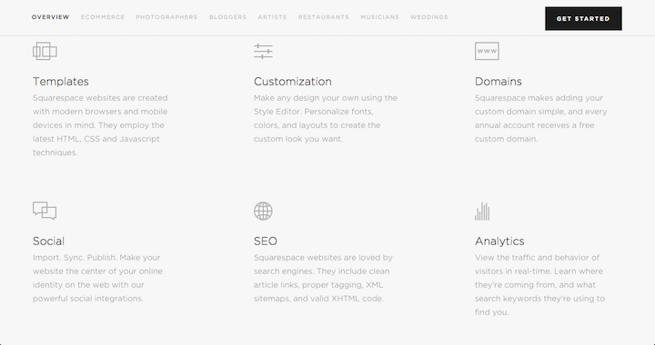
Here's an example of a low contrast website which could potentially cause a problem for even fully-sighted users with good quality hardware.

#Make interaction obvious
Avoid confusion and pain for your users by trying to clearly indicate what will happen when something is clicked. Make it obvious what is clickable on your site. Always use focus states for clickable elements so devices without hover state support can navigate your site.
#The squint test
It's useful to do a squint test on your websites to make sure your calls to action stand out. You can either use this squint test chrome extension or do it the old fashioned way and actually just partially close your eyes.
I'd argue that both of these examples pass the squint test.


#Progressively enhance
Build a core baseline experience first to ensure as many of your users as possible have a chance at using your website. This gives you a solid foundation upon which to build. Gov.uk have produced a really well-written introduction to harnessing progressive enhancement to improve accessibility which can help with this.
#Follow web standards
Stick to the most appropriate standard elements where possible. Even if you're building an intricate UI it's nearly always possible to use JavaScript and CSS to progressively enhance a form, button or a link instead of re-purposing an inappropriate element such as a div and forcing it to become clickable via JavaScript.
Browser manufacturers following web standards have already done the work for you here so why spend time and effort engineering something that only works for 50% of your users? Get stuck into the HTML5 spec and don't reinvent the wheel.
#Closed captions on video
Not just for users with hearing impairments, this is useful for anybody who cannot currently use sound for any reason. For example, somebody trying to watch the football game in a noisy room.
#Use aria attributes and roles
Enhance accessibility by using ARIA attributes and role attributes. It can be as simple as adding aria-hidden to an element that just won't make any sense to an assistive device or aria-live on an element that contains very important info that is updated as the user interacts with the website (e.g. a shopping cart might read "4 items" when a new product is added)
#And on and on...
There's much more and I could carry on and on coming up with examples but if you want to discover more I suggest you follow some of the links in this post. There is a lot of information out there should you seek it.
#Conclusion
An accessible website is one that allows as many different people and devices as possible to interact with it successfully. That's really the heart of the matter.