Accessibility issues are user experience issues

This is a follow up post with lots of examples which is intended as part 2 to my earlier post about what an accessible website is. It's based on this definition of an accessible website:
An accessible website is one that allows as many different people and devices as possible to interact with it
#Microsoft support
This user is trying to find out how to enable JavaScript in his browser because it is currently disabled. As a loyal Microsoft fan they are using Bing.com and they make sure to follow the link to the microsoft support site because they love Microsoft.
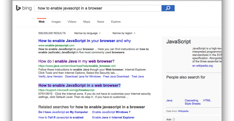
Then this happens:
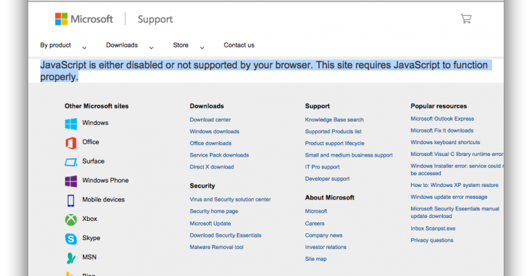
When they arrive at the microsoft support page they are told that the site requires Javascript to function. The one user who actually needed to read this page is blocked from doing so. This page is inaccessible to that user, and a poor user experience.
It's worth noting that since I captured these screenshots, Microsoft have corrected this oversight and the page now renders without requiring Javascript.
#Hacker news readability
Hacker news is a very popular website among the developer community despite having issues with poor readability of text.

WCAG 2.0 level AA requires a contrast ratio of 4.5:1 for text. This site does not pass that test and is less than ideal for a website whose entire purpose is to display text that people will read.

If you're on a VGA monitor then it's a terrible experience even for people with 20/20 vision.
Why not make the content as readable as possible? If I'm struggling to read the content then the site is inaccessible to me, and gives me a poor user experience.
We can't dictate what equipment our users will have so we have to compromise. Here's my solution to the problem:
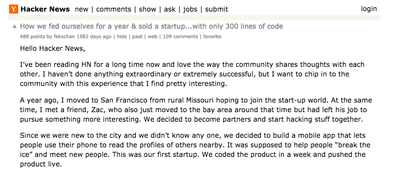
Black text on a white background with a larger line height makes it much more readable. Users can now easily read the content, which is the entire purpose of the website.
#Lush.com text over images
If you're writing text on a web page, the intention is to have people read it. If you're placing text over images, Make sure you have a high contrast between the text and the image behind so it's easily readable. Otherwise why is the text there at all?
This example of a poor implementation of text over images is from lush.com:


I'm not arguing that you should never place text over images but that when you do so, you should make sure the text is as readable as possible. Nielsen Norman Group have published some useful guidance on this subject.
#Google chrome download
In February 2013 the download link for google chrome broke because somebody broke an unrelated javascript library used by the google chrome website and included in all pages.
JavaScript is fickle. If it encounters an error it sulks and refuses to execute any more code. It's because of this that browsers were unable to handle the click action of the download link and nobody could download google chrome.
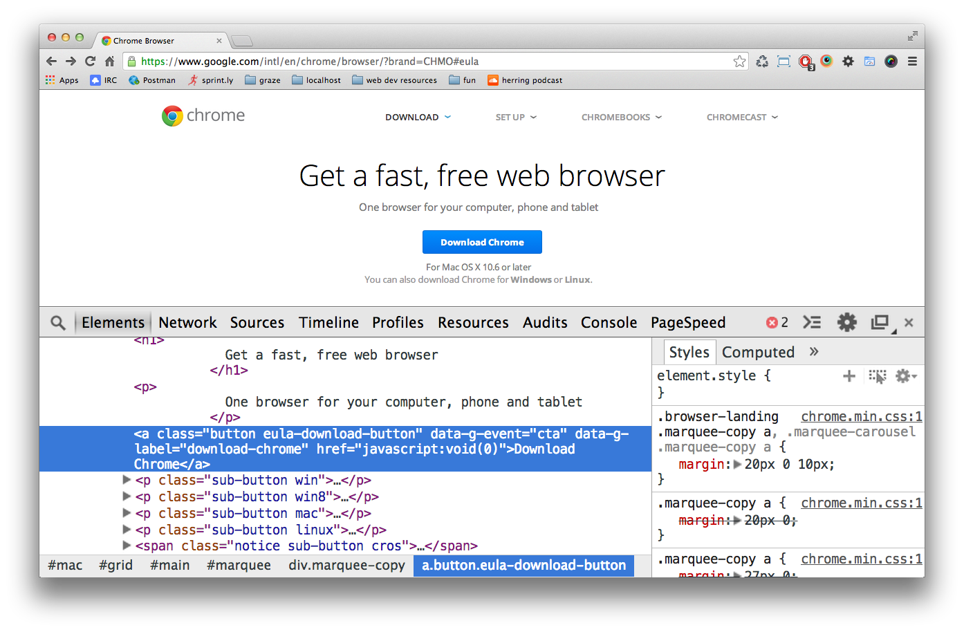
Notice there is not a valid href on the link. The default behaviour of that link is to do nothing.
#What is the purpose of this page?
The single purpose of this page is for a user to download google chrome. This purpose is inaccessible to the user when JavaScript is broken. You could argue "don't break your javascript" but all developers know that doesn't happen in reality and websites are always prone to breakage for various reasons.
So wy is this not a valid link that works without Javascript? In this case, Google are using Javascript to work out which version of chrome to give the user based on their operating system. This is a fantasic idea and provides a really great user experience (when it works).
To avoid this problem happening again, Google could have the link, by default, take users to a generic download page where all versions of google chrome are available.
This is a less pleasing user experience because it requires thought and more clicks. But we still have the "optimal" user experience when JavaScript is working (which is most of the time). If (or when) JavaScript breaks again, users can still download chrome and the single purpose of that page (to download chrome) is going to be accessible to more users.
#Amazon instant video
In 2013, shortly after joining Amazon, I went to their seattle office and was staying in a hotel where I wanted to watch a video using my amazon staff account. Unfortunately the trackpad on my mac was broken but this was no problem for me because I am a POWER USER so I used spotlight to open chrome, tabbed to the search field, found a movie, arrived on the video page
Then this happened...
I couldn't purchase the video because the "buy" button was not focusable by keyboard. Why is that button not focusable? The page is still available on the web archive so you can see for yourself if you want to but the reason is ultimately because the button was not really a button at all:
<div class="avod-button purchase" asin="B00C1BU7V8">
  <table class="avod-spritebox avod-one-click-btn" border="0" cellpadding="0" cellspacing="0">
    <tbody>
      <tr height="20">
        <td class="content" style="vertical-align: bottom;  ; background: url(/web/20130330045046im_/http://g-ecx.images-amazon.com/images/G/01/digital/video/avod-1-5/dp-sprite-total._V156422041_.png) no-repeat -4px -211px; padding: 0px 10px 0px 30px;">
          1-Click<sup>®</sup> $3.99
        </td>
        <td width="7" style="vertical-align: bottom;  ; background: url(/web/20130330045046im_/http://g-ecx.images-amazon.com/images/G/01/digital/video/avod-1-5/dp-sprite-total._V156422041_.png) no-repeat -396px -211px; line-height: 0.1px;">
          <!-- -->
        </td>
      </tr>
      <tr height="7">
        <td style="vertical-align: bottom;  ; background: url(/web/20130330045046im_/http://g-ecx.images-amazon.com/images/G/01/digital/video/avod-1-5/dp-sprite-total._V156422041_.png) no-repeat -4px -231px">
        </td>
        <td width="7" style="vertical-align: bottom;  ; background: url(/web/20130330045046im_/http://g-ecx.images-amazon.com/images/G/01/digital/video/avod-1-5/dp-sprite-total._V156422041_.png) no-repeat -396px -231px; line-height: 0.1px;">
          <!-- -->
        </td>
      </tr>
    </tbody>
  </table>
</div>
Just take a good look at this atrocity. Obviously it's a table wrapped in a div and made clickable with JavaScript.
#How can this be fixed?
This is bad because a div or table is not an innately clickable or focussable element. It was made clickable via JavaScript but was impossible to focus with the keyboard. To fix this, we could start thinking about using tabindex or handling it with Javascript but why are we putting effort into fixing this?
Why not use an element that is naturally clickable and focusable like <button>, <input> or <a>? Whoever built this has gone out of their way to ignore web standards.
#What is the point of the amazon website?
The entire purpose of the amazon website is to sell things and make money. In this instance, I was unable to buy something. The ability to buy a video was inaccessible to me and I had a poor user experience.
I'm not suggesting amazon's developers should have specifically gone out of their way to support users with broken trackpads. I'm not imagining a user story or ticket that says "as a user with a broken trackpad I want to be able to buy a video". I'm suggesting if they built it properly they would have supported those users without any extra effort and their video page would have been more accessible to more users and devices.
These days, Amazon have fixed this problem and now use a <form> with an <input> and because it's a <form>, it works natively in all browsers without JavaScript, so amazon can clearly see the benefits of making this accessible and progressively enhanced. Amazon like money, and they are now letting more users spend more money with them
#How can we build accessible websites?
Making an accessible website sounds like a lot of work but most of it comes for free if you follow web standards. It's not about putting extra effort into making it work individually for every possible user out there.
It's about putting most of your effort into building a robust, reliable, standards-driven foundation.
No matter how complex your website will eventually become, if it's built on a solid foundation, it is more likely to work for more of your users, regardless of their circumstances and the platform they are using.
As developers or designers or anybody involved in the making of a website, we should be able to make a business case for making our websites accessible to more users.
#The business case
I recently rebuilt the graze.com signup flow to more closely follow web standards and address some of the issues I have described earlier in this post.
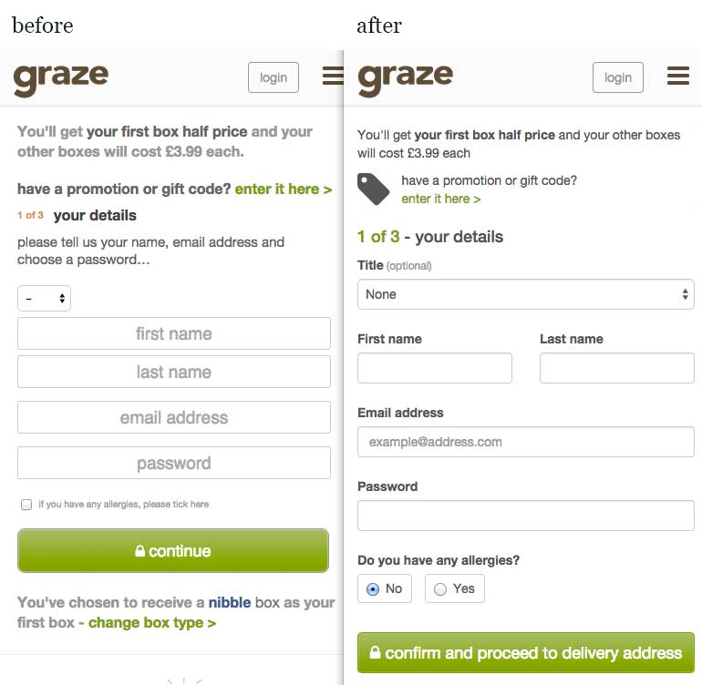
#What changed?
- Correct use of form
labelsinstead of reliance on placeholder only - HTML5 form validation
- JavaScript validation when a field loses focus
- No reliance on JavaScript (progressive enhancement)
- Larger, more readable text
- More white space between fields
#The results
On desktop there was a small improvement in conversion but 60% of graze.com's traffic is on mobile where it showed an average 7% improvement in conversion rate.

(I realise this is quite a meaningless graph without the axes and values but I censored it at the last minute in case I accidentally revealed some sensitive business information)
#Final thoughts
I already wanted to make websites that work well for as many users as possible out of a sense of pride. For example, I sometimes have trouble sleeping if I suspect I may have used a semantically inappropriate element on a page.
The good news is that making accessible websites is compatible with global capitalism.
When you frame accessiblity issues as user experience issues, it becomes easier to make a business case for spending time on it.