Reflex grid version 2
I've recently released version 2 of my Reflex grid - A lightweight responsive flexbox grid with cross browser support, an inline-block fallback and no polyfills.
This post is about some of the changes I've made for version 2.0.0 and my reasoning behind those changes. If you'd like to take a closer look at the grid you can look at it's repository on github, read the documentation, or look at some examples.
#The grid no longer uses BEM syntax
This is probably the most controversial change in version 2 and the one that needs explaining the most.
I originally discovered BEM syntax a few years ago and I was immediately sold on it's usefulness. So I went ahead and used BEM for everything. I've since changed my mind about using it for everything and these days prefer to use it for more self contained components rather than try and force it's use on classes that can actually benefit from being more flexible and could potentially be applied to any element.
In the BEM implementation of the older version of Reflex grid, the block is the .grid element, with .grid__col as an element in that block and classes such as .grid--align-center were modifiers for the block .grid.
Additional complexity arose from the way Reflex grid works in that the modifiers such as .grid--align-center could actually be applied to either .grid or .grid__col elements and this inconsistency always bothered me.
A possible solution for this was to set up specific modifier classes for the grid__col elements but I didn't want to have to duplicate every modifier class to also operate as (for example) .grid__col--align-center because duplication across classes is something that bothers me on a fundamental level.
I build a lot of sites and I'd reached the point where I was perfectly happy to use BEM for self contained components such as .nav / .nav__item / .nav--alert and would implement these alongside more generic helper classes such as .text-right-sm. To extend the BEM philosophy, the benefits of knowing when classes are just for a single (BEM style) component are just as useful as the benefits of knowing when a class is NOT part of a BEM style component and is a more general purpose class.
While building version 2 I decided to add a .container class to the grid itself because I found I was always having to add these when I implemented the grid on a new site. At this point does .container become the block and .grid become a child of that block? Should the .grid be renamed to .container__grid with .container__grid-col beneath that? If the container isn't the block but a more generically useful element not tied to BEM structure then why isn't the same also true of .grid itself?
I personally grew frustrated with the inconsistencies of using BEM for something that clearly isn't a self contained module.
So I decided to rewrite the grid without BEM. The parent element is .grid and child columns are .col. Modifiers are now more generically named as (for example) .align-center.
Since releasing it, a few people have commented on this and I am now wondering if I was too hasty in abandoning BEM for my grid. There's no doubt that when BEM works, it works really well, but I'm still not 100% sure it's right for a grid such as this which is often used to create a full page layout that contains self contained modules. I am fully open to discussion and suggestions around this so feel free to raise an issue on github or contact me via my github profile page.
#Columns are no longer flexbox by default
Before version 2, all .col elements were flexbox by default, with flex-direction: column. If you wanted to create a non flexbox display context inside that column, you would then have to use a .grid__cell element inside the column. At first this seemed like a sensible default but the more I built with the grid the more I realised that most of the time I didn't want flexbox in the columns and ended up using .grid__cell almost all of the time to set the display context back to normal so my margins would collapse and I could use floats.
So I changed the default behavior and now you have to explicitly use a .col-grid class to set up flexbox context inside columns. In my experience, this is a much more sensible default state for columns.
#I added container classes
This was a no brainer for me. Every time I built something from scratch with this grid, I would typically create a very standard container element for my grid. So I decided to add one into the grid css itself. I documented Reflex grid containers if you wish to read more.
#I only support SCSS now
In the past I used LESS as my pre-processor simply because there's really very little difference between LESS and SCSS and I was already used to LESS. Then somebody opened a pull request to add an SCSS implementation of Reflex grid so I started supporting both LESS and SCSS alongside each other.
In this new version, I decided this was a waste of time and dropped LESS usage entirely in favour of SCSS because it's the pre-processor that I now personally prefer to use.
#I dropped support for Internet explorer 6 and 7
Almost nobody uses these browsers any more and my support of them in the past was probably just out of my sometimes misdirected insistence on supporting as many browsers as possible. There are so many CSS selectors and properties that you can't use in these browsers and I ended up polluting my files with loads of horrible hacks and extra properties.
I realised I needed to swallow my pride on this one and stop wasting my time on this misplaced perfectionism that sometimes swallows up entire days of my life fighting an impossible fight.
However, the grid does still remain mostly intact in these browsers, so I can still sleep at night.
#The grid now fully works in ie10
In earlier versions I had missed or misunderstood some of the nuances of the ie10 implementation of flexbox so I went back to the drawing board by reading a lot of documentation and learning about all the bugs in this implementation. Then I fixed them all as best as I could.
#I improved the docs and examples
A lot of the examples I built for older versions used additional code that wasn't a part of the core grid CSS which led to confusion from people trying to replicate the examples. Some of the examples just flat out didn't work in older browsers (even though the grid itself did) which was inconsistent. Ultimately, I was never entirely happy with my docs in earlier versions so I rewrote them from the ground up.
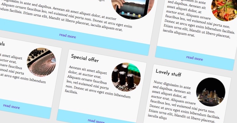
I found that one thing I constantly ended up building on top of Reflex was product cards. Although I don't want to bloat Reflex grid to have these by default I documented example cards and even linked to the supporting SCSS for people to build their own.
I've also taken extra care to add very little CSS in my examples so that they still work in older browsers. I've also provided some links to the SCSS for those examples so people can use that code as a starting point for their own implementations.
If you're interested in looking at the old docs or need them because you're still using the older version, I have preserved them in a sub folder of the current docs site.
#Thanks
Thanks to everybody who uses Reflex grid. I want to especially thank those who comment, raise issues, and take the time to open pull requests. I initially built this for myself but it's nice to know that other people find it useful. I don't know of any other flexbox grids that have an inline-block fallback so as far as I know I've built something quite unique and I'm proud of it.
I am fully open to discussion and suggestions around this so feel free to raise an issue on github or contact me via my github profile page.